Executive Summary
- We built and deployed a dashboard to monitor the governor election in Coahuila , a first-of-its-kind solution offering real-time insights on social media interactions, sentiment analysis, key narratives and social network analysis.
- We then designed a streamlined process to efficiently monitor anything, with three features: automated data integration, data storage and manipulation, dashboard design.
- We are providing workshops to teach audiences, especially those from social science and media backgrounds, how to deploy customized dashboards on their own.
Stage 0: How it all started?
An email from Mexico
Over the years, Information Tracer has grown from a simple research tool to a powerful social media analytics system. We were fortunate to work with many collaborators who pushed us to build a more robust product.
In early 2023, we started to explore more use cases. A primary one is to deploy Information Tracer to monitor regional elections. Why? Election misinformation is rampant in many countries, especially those in the Global South. The consequences are severe when a dishonest leader is elected.
However, for many weeks, we struggled to find local contacts who understand regional politics in non-English-speaking countries. One day, an opportunity was presented to us, and we decided to seize it.
It all started with an email from Alejandro, a Professor at Tec de Monterrey. Alejandro's research focuses on communication, public opinion, and the intersection of traditional and emerging media. Currently, he is studying political discourse and propaganda on social media. In the email, Alejandro expressed an interest in using Information Tracer API for his research, and proposed two use cases:
- The president of Mexico, Andres Manuel Lopez Obrador, gives two-hour daily speeches that media and platforms broadcast (I never knew!). That has a lot of consequences for misinformation and disinformation.
- In 2024, Mexico will have presidential elections and that will impact the local digital ecosystem in terms of misinformation and disinformation.
Looking at his email, we were thrilled – Alejandro appeared to be the perfect match we had been seeking for so long. We soon started to work together!
Although our goal is to monitor the 2024 national election, we have to start small. As a testing field, we decided to use a smaller-scale election as our testing field – the Coahuila governor election.
About the Coahuila Election
Coahuila is a state in northern Mexico that shares a border with Texas. The electoral campaign begins on April 2, 2023 and runs for eight weeks until May 31. The final election is held on June 4, 2023.
The four candidates are:
- Manolo Jiménez from PRI
- Armando Guadiana from MORENA
- Ricardo Mejía Berdeja, from the PT
- Evaristo Lenin Pérez from UDC
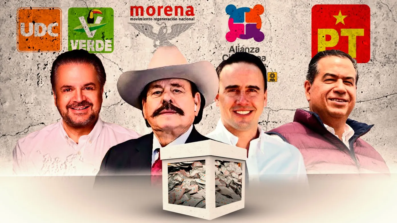 Four candidates for 2023 Coahuila governor election (source)
Nationally, there are four main political parties in Mexico, PRI, PAN, PRD and MORENA. In Coahuila, the former governor is from the PRI. However, both the PRI and the opposing parties have a large number of supporters within the state. So if Coahuila is flipped to Morena in the governor election, the party’s 2024 presidential candidate would enjoy a huge advantage.
Limitation of Information Tracer
To monitor the Coahuila election, Information Tracer has two limitations.
The first is task scheduling. If we only want to monitor for a fixed time period, Information Tracer can already handle the task. Simply input a keyword and set the search time range to the desired period. However, daily monitoring presents a challenge. To obtain the most recent data, we would need to repeat the same search daily, download the results, and then manually compile the data from each day.
The second is analyzing multiple candidates. Using Information Tracer, we can only get data for one candidate per query. If we combine keywords for multiple candidates, all the data will be mixed together.
To address those limitations, we decided to build a Superset dashboard hosted on Google Cloud . The cloud naturally handles automated scheduling. With Apache Superset, we can write SQL queries to pull data about different candidates, generate multiple graphs, and visualize them in a single dashboard. Using a fixed theme dashboard is also a better delivery option, especially when we want to demonstrate to a larger audience.
Stage 1: Initial Design
Data Collection
For each candidate, we curate a list of keywords and connect them using the “OR” condition. For example, for the candidate Armando Guadiana, we use all variations of his name as keywords. We want to find social media posts that contain either one of these words, so we design the query as below:
"Armando Guadiana Tijerina" OR aguadiana OR armandoguadianatijerina
OR ArmandoGuadianaTijerina
Then, we use Information Tracer API to query related social media posts.
              id_hash256 = informationtracer.trace(query, token)
url = "https://informationtracer.com/api/v1/result?token={}&id_hash256={}".format(token, id_hash256)
results = requests.get("url").json()
The data collection script is designed to automatically collect discussions about the election daily and also to refresh old discussion statistics, as real-time interactions tend to stabilize 48h after posting time.
Visualization
Let’s walk through different modules of the prototype dashboard and how it can help the general public better understand the election.
Interactions
What does the graph do?
This module visualizes four candidates’ aggregated interactions
from Twitter, Facebook, Instagram and YouTube over time.
It also visualizes interactions breakdown by platform and by
candidates (16 plots in total!).
Why is the graph helpful?
Interaction graphs help people understand which candidates are
generating the most conversation and start wondering why that
might be the case.
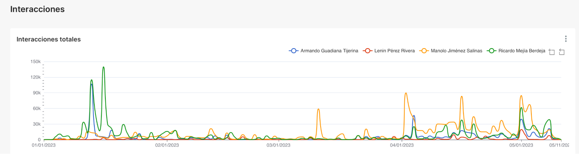
They also help people understand the reach and influence of each candidate on different social media platforms. If a candidate is particularly popular or unpopular on a specific platform, it might be signs of targeted campaigns on specific demographics or echo chambers (like-minded online communities reinforce each other's beliefs and opinions, information that challenges the prevailing narrative may be suppressed).
Sentiment Analysis
What does the graph do?
This module visualizes the cumulative number of posts for each
type of sentiment (positive, neutral and negative) using histogram
plots, and visualizes the daily volume of posts for each sentiment
type on each platform regarding each candidate.
Why is the graph helpful?
The cumulative plot can help the public understand
the general sentiment toward each candidate .
For example, from the left, we can see Manolo has the highest
positive sentiment among all candidates (he also in general has
the most interactions). This corresponds with the voting
statistics bottom right: he’s been leading and finally won the
election.
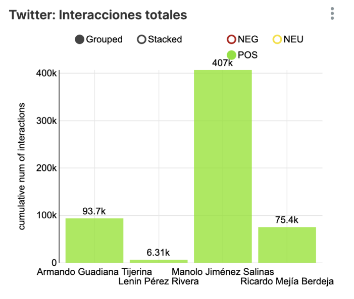
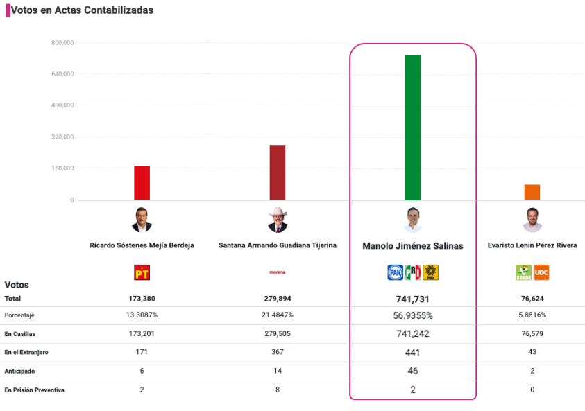
The time series plot enables people to understand how public sentiment changes over time . Peak and valley points could be indicative of important events or turning points in the campaign. For example, in the below graph around the final election date (June 4th), we can see Manolo has unparalleled positive sentiments.
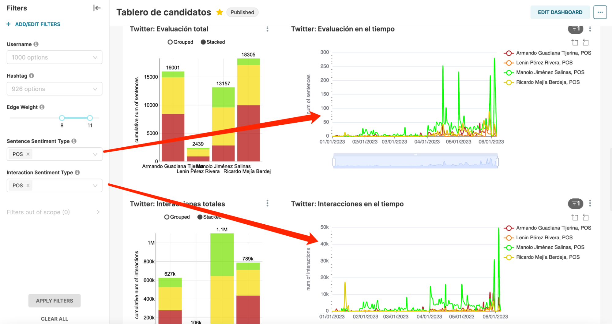 Filters from the left sidebar control if the graph shows
positive, neutral or negative sentiment.
Filters from the left sidebar control if the graph shows
positive, neutral or negative sentiment.
We also provide a weighed-by-interactions version to take the influence of the post into consideration, potentially accounting for some bias.
Principal Actor and Keyword
What does the graph do?
For each platform, we identify the most influential accounts and
highlight the main topics of conversation in the last 14 days for
each candidate.
Why is the graph helpful?
By looking at the top accounts of each platform, we can understand
more or less who’s leading the narrative. And by
checking the latest keywords in online discussions, we could
identify potential misinformation if certain keywords seem out of
place or misleading.
Social Network Analysis
What does the graph do?
We visualize the social network as a directed graph. Nodes can
either be a user, a hashtag or an URL. If a user posts under the
hashtag or posts the URL, the edge will point to the posted
content. We weigh edges by interactions.
Why is the graph helpful?
This network graph makes it easier to
observe the spread of information across platforms and identify
the key influencers in the conversation
(the node with the most outcoming heavy edges). If certain users
or hashtags are particularly influential, it might prompt
individuals to scrutinize these sources more carefully for
potential misinformation.
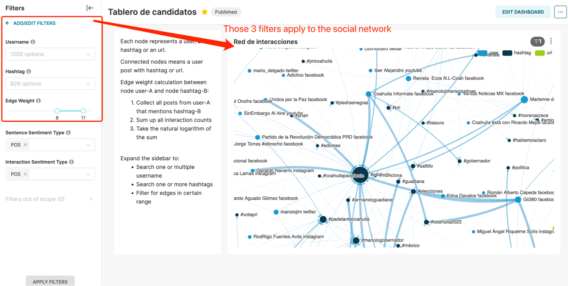
The graph also helps journalists to identify coordinated campaigns – for example, when similar accounts are linked with similar topics.
The filter functions allow the public to focus on the most important players or links in the network, and to identify sources of misinformation.
Stage 2: How to democratize election monitoring -- a cloud-based solution
A successful prototype for the Coahuila election
In early May, Zhouhan visited TEC and shared our research with students. He also delivered several workshops to teach journalists how to identify hate speech and coordinated campaigns using Information Tracer.

The Coahuila election took place on June 4th, and candidate Manolo from PRI won, aligning perfectly with our dashboard's statistics. This news brought a lot of excitement, as it confirmed the effectiveness of our prototype. At that moment, we knew we are ready to build the national election monitoring dashboard on top of this prototype.
New challenges in building another dashboard
However, as we actually dived into the rebuilding process, we faced some challenges. It wasn't so much a technical hurdle as it was a rather labor-intensive one. The prototype has around 50 different plots, and if we were to replicate and adjust each one manually, the workload would be massive and tedious. This prompted us to think, if we want to generalize this dashboard, we must make it migratable.
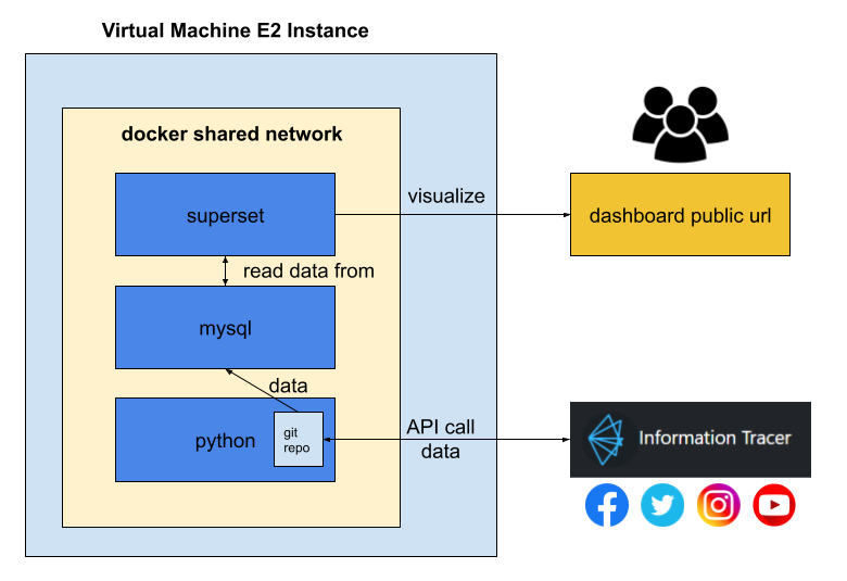
We came up with the following architecture:
 More details on installation are available
here
More details on installation are available
here
Our solution – a dashboard factory
A dashboard factory refers to a centralized system that enables easy creation, management, and deployment of dashboards.
The dashboard factory is constructed with three components:
- Automated Data Integration: We utilize a Python-based automated data collection script within a Docker environment. This script interacts with the Information Tracer API to retrieve data and consolidates the collected information into databases. It generates logs each time data is collected to monitor if all modules are finished without errors.
- Data storage and manipulation: We employ a MySQL Docker container for data storage. Through Superset SQL Lab, we can transform, filter, and aggregate data for each dashboard.
- Dashboard Design: We employ Apache Superset Docker containers, accompanied by a prebuilt dashboard prototype.
All three components are connected in the same docker network to facilitate easy communication.
we tested this architecture on the Morena party’s election which leads up to the national election. With a well-configured environment and dashboard prototype template (the one we built for the Coahuila election), all statistics and legends switch to the new one automatically. The whole process takes less than 1 min.
Stage 3: Next Steps
We are currently working on multiple frontiers:
Offering training and workshops
As mentioned before, during Zhouhan’s visit to TEC, he delivered several workshops to teach journalists how to identify hate speech and coordinated campaigns using Information Tracer. On July 5th, we also conducted a workshop for professors and students from TEC to guide them through the process of setting up virtual machines and hosting the dashboard architecture .
From all our workshop experiences, we have noticed that a considerable portion of the audience comes from social science or media backgrounds. Many of them have limited coding skills and have never interacted with the command line before. However, they have shown remarkable progress through our workshops. While developing powerful tools is important, teaching a broader audience, especially those less technical holds the same importance. It gives everyone the power to analyze and understand what's really going on. This leveraging effect will bring us closer to truly democratizing social media data. We have standardized workshop delivery flows and are expanding our reach to assist more individuals.
Exploring RegTec for financial stability monitoring
We've also showcased this election monitoring dashboard to friends from various industries, and their feedback has spurred us to think beyond its current applications – not limited solely to political processes. As long as we have different keywords that we want to compare, the possibilities are vast.
If we set keywords to be stock tickers, the dashboard can show public sentiment toward individual stocks, which might affect the stock market (remember back in 2021, a Reddit group drove up the price of GameStop for 600% in four days, if we could know that at day one…). Likewise, if we set keywords to be names of financial institutions, this dashboard is turned into a tool for risk management (see the graph below about Silicon Valley Bank).
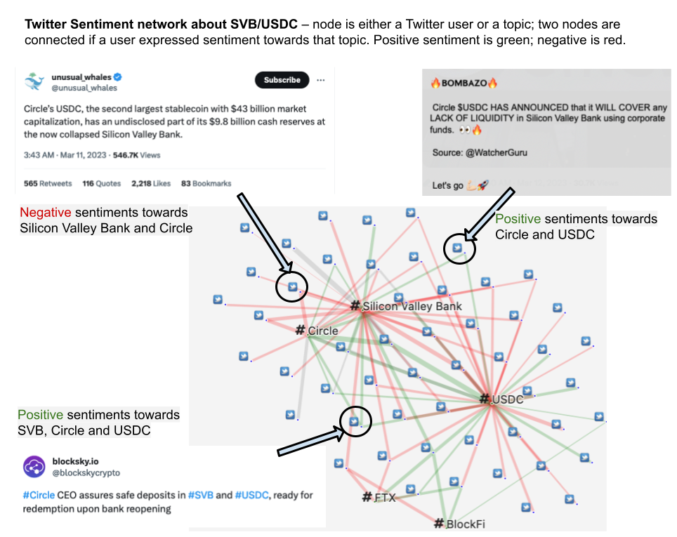 Crypto company Circle deposited billions of dollars in the
Silicon Valley Bank. The collapse of SVB trigger fear about USDC
(a cryptocurrency form Circle). The graph shows Twitter users'
sentiments toward those entities. Some users feel negative about
the bank collapse, others are positive about the resilience of the
crypto market.
Crypto company Circle deposited billions of dollars in the
Silicon Valley Bank. The collapse of SVB trigger fear about USDC
(a cryptocurrency form Circle). The graph shows Twitter users'
sentiments toward those entities. Some users feel negative about
the bank collapse, others are positive about the resilience of the
crypto market.
Proactively discovering campaigns
We continue to monitor hot topics and investigate the existence of coordinated campaigns. Recently, the 'Anti-ULEZ' campaign has come to our attention. This campaign opposes the implementation of an 'Ultra Low Emission Zone' (ULEZ) in Greater London. While the campaign was initiated in 2022, it gained significant traction in 2023.
To identify inauthentic accounts, we use Information Tracer to track the evolution of narratives, measure nuanced sentiments, and quantify bot behavior. Through this process, we uncovered Facebook groups with similar names, and suspicious Twitter accounts that extensively use shared hashtags, share campaign websites, and express extreme views. We have also outlined a systematic approach to distinguish between bot and human accounts. Click here to learn more about it.
Keep investing in election disinformation monitoring
As the presidential elections in Mexico are scheduled for 2024 (also in the US), we will keep iterating our dashboard, adding more features and analytics. We hold the hope that our dashboard will have evolved into a more potent and accessible tool, to advance the use of social media data for democratic purposes.
It may appear that opportunities found us (Alejandro's email), but we believe if the heart does not desire something, it will never ever come to you. We seek opportunities just as they are drawn to us. Our path remains open for exploration and new possibilities...
Further Readings
- Learn about how to use Information Tracer API
- Interested in deploying your own dashboard for keyword monitoring?
- Our media coverage
- The Coahuila election dashboard is currently stopped due to limited server capacity. If you are interested, feel free to reach out to us at zhouhan@safelink.network.